MetaFabric
Rapid Development Platform for Business Process Digitisation
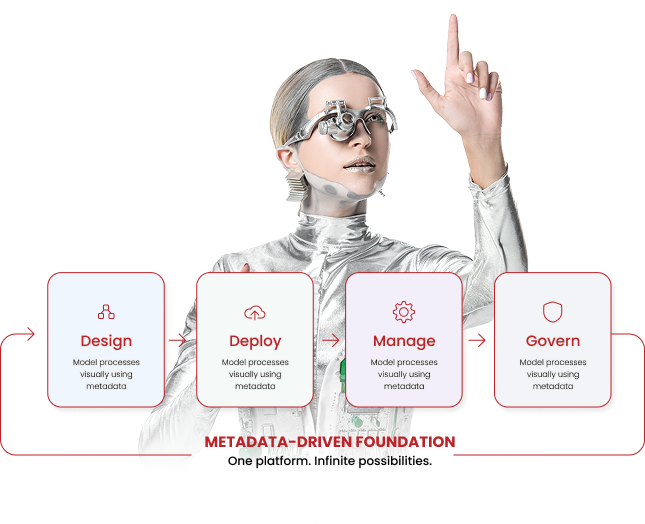
A next-generation, metadata-driven Low-Code / No-Code platform engineered to accelerate the design, deployment, and management of complex enterprise business processes — without writing application code.
Metadata-Driven
Low-Code / No-Code
Enterprise-Grade
Built for organisations where governance
can’t be an afterthought.
1
Enterprise Expertise
Purpose-built for the demands of regulated industries,
and large enterprises where data integrity, process
governance, and on-premise deployment are non-negotiable.
2
Empowered Experience
Empowers domain experts—business analysts and process
owners—to configure new entities and workflows without
developer intervention, eliminating repetitive
development.
3
Business Benefits
Reduces time-to-deployment dramatically. New operational
processes go from requirements to live, role-secured
digital process—deploying days to weeks instead of
months.
Stitching data, workflow, and access control
into a single, integrated engine.
Metadata as the Single Source of Truth
Define a business entity once, and the platform automatically generates the full digital process. MetaFabric’s engine provisions the database table, REST APIs, and frontend forms with zero additional development required. Define data once, deploy everywhere.
Enterprise-First Architecture & RBAC
Security, auditability, and governance are built-in, not bolted on. MetaFabric implements a two-layer Role-Based Access Control model — entity-level role permissions and row-level user permissions — making unauthorized access architecturally impossible.
Dynamic Workflow Engine
Enable any entity to have a configurable multi-step approval process. Workflows feature role-gated transitions, dynamic action buttons, and a permanent action log that records every state transition immutably.
AI Genie Assistant
Interact with your data using an integrated natural-language AI assistant. Ask questions in plain English to query data and schemas, with dynamic RBAC enforcement ensuring the AI never accesses unauthorised records.
Offline-Ready Mobile Application
Stay connected with a dedicated app designed for environments with intermittent connectivity.
Take Your Business Processes
To The Next Level
LigSphere makes it easy for your agents to access data, understand
context, and operate across your entire system.
Foundation
- Infrastructure provisioning and containerized stack deployment
- SSO integration with your identity provider
- Quick entity configuration, Platform setup
Rollout
- Configuration of remaining business processes
- Workflow design and role permission mapping
- Dashboard configuration for operational KPIs and UAT
Hand Over
- Field staff onboarding and mobile app distribution
- Administrator training and documentation handover
- Production go-live and hypercare support
Take Your Business Processes To The Next Level
A three-phase rollout, backed by ongoing enterprise support — not a big-bang deployment.
02
Rollout
- Configuration of remaining business processes
- Workflow design and role permission mapping
- Workflow design and role permission mapping
01
Foundation
- Infrastructure provisioning and containerised stack deployment
- SSO integration with your identity provider
- Quick entity configuration, Platform setup
03
Handover
- Field staff onboarding and mobile app distribution
- Administrator training and documentation handover
- Production go-live and hypercare support
We invest our minds and resources
to develop your technology.
100% Data Sovereignty
Full on-premise or private-cloud deployment ensures no data ever leaves the client infrastructure.
Rapid Deployment
Go live with new processes in days or weeks, bypassing the 3–6 month lifecycle of traditional custom software development.
Unmatched Compliance
Complete, tamper-evident audit trails and immutable activity logs ensure alignment with strict enterprise governance standards.
Low Vendor Lock-in
Built on a modern, open-standards technology stack (React, Node.js, Microsoft SQL Server) minimizing vendor dependency.
+0%
Engineer Productivity
Agenix Architecture
One AI orchestration layer. Every major enterprise platform. Full lifecycle — delivery, support, and modernization.
One Platform.
Five Enterprise Systems.
Same agentic depth across every platform — implementation, enhancement, support, and modernization.
SAP
S/4HANA · ECC
BTP · UI5 · ABAP
Oracle
EBS · Fusion
Cloud Applications
Dynamics
365 · F&O
Business Central
Salesforce
Sales · Service Cloud
Apex · LWC
ServiceNow
ITSM · ITOM
App Engine
<style>
@import url('https://fonts.googleapis.com/css2?family=Poppins:wght@100;200;300;400;500;600;700;800;900&display=swap');

.business-process-section{
    padding:90px 20px;
    background:#ffffff;
    font-family:'Poppins',sans-serif;
}h3 {
    font-size: 22px !important;
    font-family: 'Poppins', Regular !important;
}
pre {display:none}

.hide {display:none}
.bgGrey{ background:#FAFAFA;}
.bgGrey2{ background:#F3F3F3 !important;}
.bgGrey3Dark{ background:#EEEEEE;}
.bgBRRed{background:#bc2227 !important;}
.bgBRRed h3 { color: white}

ul li::marker {
  color: #ffffff; /* Sets the bullet color to orange-red */
}

.business-process-container{
    max-width:1240px;
    margin:auto;
}

.business-process-heading{
    text-align:center;
    margin-bottom:60px;
}

.business-process-heading h2{
    margin:0;
    font-size: 42px !important;
    line-height: 1.08 !important;
    font-weight: 200 !important;
    color: #111111 !important;}

.business-process-heading p{
    margin:18px auto 0;
    max-width:700px;
    font-size:15px;
    color:#9b9b9b;
    line-height:1.8;
    font-weight:400;
}


.grid-2Boxes{
    display:grid;
    grid-template-columns:repeat(2,1fr);
    gap:28px;
margin:50px Auto;
}

.process-grid{
    display:grid;
    grid-template-columns:repeat(3,1fr);
    gap:28px;
}

.process-card{
    background:#f7f7f7;
    border-radius:12px;
    padding:40px 30px;
    text-align:center;
    transition:.35s;
}

.process-card:hover{
    transform:translateY(-6px);
    box-shadow:0 18px 40px rgba(0,0,0,.08);
}

.process-icon{
    margin-bottom:18px;
}

.process-icon img{
    width:42px;
    display:block;
    margin:auto;
}

.process-card h3{
    margin:0 0 22px;
    font-size:22px !important;
    font-weight:400;
    color:#222;
}

.process-card ul{
    margin:0;
    padding-left:18px;
    text-align:left;
}

.process-card ul li{
    color:#8c8c8c;
    font-size:14px;
    line-height:1.9;
    margin-bottom:10px;
    font-weight:400;
}

.process-card ul li:last-child{
    margin-bottom:0;
}

/* Tablet */

@media(max-width:991px){

.process-grid{
    grid-template-columns:repeat(2,1fr);
}

.business-process-heading h2{
    font-size:34px;
}

}

/* Mobile */

@media(max-width:767px){

.business-process-section{
    padding:70px 20px;
}

.business-process-heading{
    margin-bottom:40px;
}

.business-process-heading h2{
    font-size:28px;
}

.business-process-heading p{
    font-size:14px;
}

.process-grid{
    grid-template-columns:1fr;
    gap:20px;
}

.process-card{
    padding:30px 24px;
}

.process-icon img{
    width:38px;
}

.process-card h3{
    font-size:17px;
}

.process-card ul li{
    font-size:13px;
}

}


.ai-journey-section{
    padding:90px 20px;
    background:#ffffff;
    font-family:'Poppins',sans-serif;
}

.ai-journey-container{
    max-width:1240px;
    margin:auto;
}

.ai-title{
    text-align:center;

    margin-bottom:70px;

font-size: 42px !important;
    line-height: 1.08 !important;
    font-weight: 200 !important;
    color: #111111 !important;
}

.ai-steps{
    display:flex;
    justify-content:space-between;
    gap:60px;
}

.ai-step{
    display:flex;
    align-items:flex-start;
    gap:18px;
    flex:1;
}

.step-number{
    flex-shrink:0;
}

.step-number img{
    width:38px;
    display:block;
}

.step-content h3{
    font-size: 22px !important;
    line-height: 30px;
    margin-bottom: 10px;
    font-weight: 400;
    margin:0 0 10px;
    color: #222222;
}

.step-content p{
    margin:0;
    font-size:16px;
    color:#222;
    line-height:1.8;
    font-weight:400;
}

/* Tablet */

@media(max-width:991px){

.ai-steps{
    flex-direction:column;
    gap:45px;
}

.ai-title{
    font-size:30px;
    margin-bottom:50px;
}

}

/* Mobile */

@media(max-width:767px){

.ai-journey-section{
    padding:70px 20px;
}

.ai-title{
    font-size:26px;
}

.ai-step{
    gap:15px;
}

.step-number img{
    width:32px;
}

.step-content h3{
    font-size:16px;
}

.step-content p{
    font-size:13px;
    line-height:1.7;
}

}


.brbtn {
    color: #000 !important;
    border: 1px solid #000;
    border-radius: 3px;
    font-family: 'Poppins', sans-serif;
    font-size: 16px;
    font-weight: 400;
    text-transform: none !important;
    text-decoration: none;
    background: transparent;
    display: inline-flex;
    align-items: center;
    justify-content: center;
    min-width: 180px;
    height: 50px;
    transition: all 0.3s ease;

}

.brbtn:hover {
    background: #9a0003;
    border-color: #9a0003;
    color: #fff !important;
}
.hides{
display:none !important;
}
.home h1 {
    font-size: 144px !important;
    font-weight: 300 !important;
    font-family: 'Poppins', sans-serif !important;
}
@media (max-width: 768px) {
    .home h1 {
        font-size: 90px !important;
        line-height: 1.2 !important;
    }
}
body.page .entry-header,
body.page .page-header,
body.page h1.entry-title {
  display: none !important;
}
* {
  font-family: "Poppins";
}

/* HERO SECTION */
.agenix-hero-section {
  min-height: calc(100vh - 70px);
  padding: 70px 8% 50px 12%;
  align-items: center;
background: linear-gradient(180deg, rgba(238, 238, 238, 1) 0%, rgba(255, 255, 255, 1) 100%);

}

.agenix-hero-left,
.agenix-hero-right {
  display: flex;
  align-items: center;
  min-height: 650px;
}

.agenix-hero-left {
  justify-content: flex-start;
}

.agenix-hero-right {
  justify-content: center;
}

.agenix-content {
  max-width: 760px;
}

.agenix-meet {
  font-size: 26px !important;
  line-height: 1.1;
  color: #1b0096;
  margin: 0 0 -36px 0;
  font-weight: 200;
}

.Pg_bnr_title {
  font-size: 70px !important;
color:#bc2722;
  line-height: 1.3 !important;
   -webkit-background-clip: text;
  background-clip: text;
   font-weight: 300 !important;
  margins: 0 0 34px 0 !important;
  letter-spacing: -3px;
  text-shadow: 0 5px 8px rgba(0, 0, 0, 0.18);
}

.agenix-title {
  font-size: 70px !important;
  line-height: 1.3 !important;
  background: linear-gradient(#1B0096, #C0007A);
  -webkit-background-clip: text;
  background-clip: text;
  -webkit-text-fill-color: transparent;
  color: transparent;
  font-weight: 300 !important;
  margins: 0 0 34px 0 !important;
  letter-spacing: -3px;
  text-shadow: 0 5px 8px rgba(0, 0, 0, 0.18);
}

.agenix-description {
  font-size: 20px !important;
  line-height: 1.4;
  color: #111111;
  font-weight: 200 !important;

font-family: 'Poppins';
}

/* Animated Hero Pill */
/* Animated Hero Pill */
.agenix-pill {
  display: inline-flex;
    align-items: left;
    justify-content: left;
    backgrounds: linear-gradient(90deg, #1B0096 0%, #C0007A 100%);
    color: #1B0096;
    padding: 23px 4px;
    /* border-radius: 999px; */
    min-width: 250px;
    height: 50px;
    font-size: 20px;
    line-height: 1;
    vertical-align: middle;
    /* margin-left: 10px; */
    position: relative;
    top: -5px;
    overflow: hidden;
}

.agenix-pill .agenix-rotating-text {
  display: flex !important;
  flex-direction: column !important;
  height: 34px !important;
  line-height: 34px !important;
  overflow: hidden !important;

}

.agenix-pill .agenix-rotating-text > span {
  display: block !important;
  flex: 0 0 34px !important;
  height: 34px !important;
  line-height: 34px !important;
  white-space: nowrap !important;
  text-align: left !important;
  animation: agenixRotate 10s infinite !important;
}

@keyframes agenixRotate {
  0%, 20% {
    transform: translateY(0);
  }

  25%, 45% {
    transform: translateY(-34px);
  }

  50%, 70% {
    transform: translateY(-68px);
  }

  75%, 95% {
    transform: translateY(-102px);
  }

  100% {
    transform: translateY(0);
  }
}

@media (max-width: 991px) {
  @keyframes agenixRotate {
    0%, 20% {
      transform: translateY(0);
    }

    25%, 45% {
      transform: translateY(-30px);
    }

    50%, 70% {
      transform: translateY(-60px);
    }

    75%, 95% {
      transform: translateY(-90px);
    }

    100% {
      transform: translateY(0);
    }
  }
}

@media (max-width: 767px) {
  .agenix-pill {
    height: 46px !important;
    min-width: 190px !important;
    overflow: hidden !important;
  }

  .agenix-pill .agenix-rotating-text {
    height: 24px !important;
    line-height: 24px !important;
    overflow: hidden !important;

  }

  .agenix-pill .agenix-rotating-text > span {
    flex: 0 0 24px !important;
    height: 24px !important;
    line-height: 24px !important;
    display: block !important;
    white-space: nowrap !important;
    text-align: left !important;
    animation: agenixRotateMobile 10s infinite !important;
  }
}

@keyframes agenixRotateMobile {
  0%, 20% {
    transform: translateY(0);
  }

  25%, 45% {
    transform: translateY(-30px);
  }

  50%, 70% {
    transform: translateY(-60px);
  }

  75%, 95% {
    transform: translateY(-90px);
  }

  100% {
    transform: translateY(0);
  }
}

/* Hero Buttons */
.agenix-actions {
  display: flex;
  gap: 18px;
  margin-top: 40px;
}

.agenix-button {
  display: inline-flex;
  align-items: center;
  justify-content: center;
  min-width: 200px;
  height: 50px;
  background: #BC2227;
  color: #ffffff !important;
  border-radius: 4px;
  font-size: 16px;
  font-weight: 400;
  text-decoration: none !important;
letter-spacing: normal;
}

.agenix-button:hover {
  background: #a9151b;
  color: #ffffff !important;
}

/* Hero Image */
.agenix-media img,
.agenix-media {
  max-width: 100% !important;
  width: 100% !important;
  height: auto !important;
  display: block;
}

/* ===============================
   RESPONSIVE — HERO SECTION ONLY
================================ */

/* Tablet */
@media (max-width: 991px) {
  .agenix-hero-section {
    min-height: auto;
    padding: 60px 8% 50px 12%;
  }

  .agenix-hero-left,
  .agenix-hero-right {
    min-height: auto;
    display: flex;
    align-items: center;
    justify-content: center;
  }

  .agenix-content {
    max-width: 100%;
  }

  .agenix-meet {
    font-size: 28px !important;
  }

  .agenix-title {
    font-size: 82px !important;

    margin-bottom: 28px !important;
  }

  .agenix-description {
    font-size: 34px !important;
    line-height: 1.45;
    letter-spacing: -0.8px;
  }

  .agenix-pill {
    min-width: 220px;
    height: 54px;
    font-size: 24px;
  }

  .agenix-pill .agenix-rotating-text {
    height: 30px !important;
    line-height: 30px !important;
  }

  .agenix-pill .agenix-rotating-text > span {
    flex: 0 0 30px !important;
    height: 30px !important;
    line-height: 30px !important;
  }

  .agenix-actions {
    margin-top: 50px;
    gap: 16px;
  }

  .agenix-button {
    min-width: 190px;
    height: 46px;
    font-size: 18px;
  }

  .agenix-media,
  .agenix-media img {
    max-width: 420px !important;
  }
}

/* ===============================
   MOBILE HERO POLISH
================================ */

@media (max-width: 767px) {
  .agenix-hero-section {
    display: flex !important;
    flex-direction: column !important;
    align-items: center !important;
    padding: 42px 20px 55px 20px !important;
    text-align: center;
    gap: 0;
  }

  .agenix-hero-left,
  .agenix-hero-right {
    width: 100% !important;
    max-width: 100% !important;
    flex-basis: 100% !important;
    min-height: auto !important;
    display: flex;
    justify-content: center;
  }

  .agenix-content {
    max-width: 340px;
    margin: 0 auto;
  }

  .agenix-meet {
    font-size: 24px !important;
    margin-bottom: 2px;
  }

  .agenix-title {
    font-size: 58px !important;
    line-height: 0.95 !important;
    letter-spacing: -2px;
    white-space: nowrap;
    margin-bottom: 28px !important;
  }

  .agenix-description {
    font-size: 25px !important;
    line-height: 1.35;
    letter-spacing: -0.4px;
  }

  .agenix-pill {
    display: inline-flex;
    margin: 18px auto 0 auto;
    top: 0;
    min-width: 190px;
    height: 46px;
    font-size: 18px;
    padding: 8px 26px;
  }

  .agenix-hero-right {
    margin-top: 24px;
    margin-bottom: 28px;
  }

  .agenix-media,
  .agenix-media img {
    max-width: 210px !important;
    width: 100% !important;
    margin: 0 auto !important;
  }

  .agenix-actions {
    margin-top: 0;
    flex-direction: column;
    align-items: center;
    gap: 12px;
  }

  .agenix-button {
    width: 100%;
    max-width: 260px;
    min-width: 0;
    height: 46px;
    font-size: 15px;
    border-radius: 5px;
  }
  .agenix-hero-right {
    display: none !important;
  }

  .agenix-hero-section {
    padding-bottom: 50px !important;
  }

  .agenix-actions {
    margin-top: 38px !important;
  }
}

@media (max-width: 430px) {
  .agenix-title {
    font-size: 52px !important;
  }

  .agenix-description {
    font-size: 23px !important;
  }

  .agenix-media,
  .agenix-media img {
    max-width: 190px !important;
  }
  .agenix-hero-section {
    padding: 42px 18px 36px 18px;
  }

  .agenix-actions {
    flex-direction: column;
    align-items: center;
  }

  .agenix-button {
    width: 100%;
    max-width: 260px;
  }
}

/* STATS SECTION */
.agenix-stats-section {
  width: 100%;
  padding: 55px 8% 80px 12%;
  background: #ffffff;
  box-sizing: border-box;
}

.agenix-stats-wrap {
  width: 100%;
  max-width: 1280px;
  margin: 0 auto;
  display: flex;
  justify-content: space-between;
  align-items: center;
  gap: 28px;
  flex-wrap: nowrap;
}

.agenix-stat-pill {
  position: relative;
  overflow: hidden;
  width: 280px;
  height: 150px;
  border-radius: 999px;
  background: linear-gradient(90deg, #1B0096 0%, #C0007A 100%);
  color: #ffffff;
  display: flex;
  flex-direction: column;
  align-items: flex-start;
  justify-content: center;
  padding: 0 28px;
  box-sizing: border-box;
  opacity: 0;
  transform: translateY(28px);
  transition: opacity 0.7s ease, transform 0.7s ease;
}

.agenix-stat-pill.is-visible {
  opacity: 1;
  transform: translateY(0);
}

.agenix-stat-pill::before {
  content: "";
  position: absolute;
  top: 0;
  left: -120%;
  width: 120%;
  height: 100%;
  background: linear-gradient(90deg, #1B0096 0%, #C0007A 100%);
  border-radius: inherit;
  transition: left 0.55s ease;
  z-index: 0;
}

.agenix-stat-pill:hover::before {
  left: 0;
}

.agenix-stat-number,
.agenix-stat-label {
  position: relative;
  z-index: 1;
}

.agenix-stat-number {
  font-size: 42px;
  line-height: 1.1;
  font-weight: 200;
  margin-bottom: 4px;
}

.agenix-stat-label {
  font-size: 16px;
  line-height: 1.2;
  font-weight: 400;
  opacity: 0.95;
}

/* SECTION 2: AGENIX ARCHITECTURE */
.agenix-architecture-section {
  width: 100%;
  padding: 90px 8% 170px 12%;
  background: #F8F8F6;
  box-sizing: border-box;
}

.agenix-architecture-section > * {
  max-width: 1280px;
  margin-left: auto;
  margin-right: auto;
}

.agenix-architecture-heading {
  margin: 0 0 12px 0 !important;
  font-size: 42px !important;
  line-height: 1.08 !important;
  font-weight: 200 !important;
  color: #111111 !important;
}

.agenix-architecture-subheading {
  margin: 0 0 55px 0 !important;
  max-width: 980px;
  font-size: 18px !important;
  line-height: 1.6 !important;
  color: #000 !important;
font-weight: 200;
}

.agenix-architecture-image,
.agenix-architecture-image img {
  width: 100% !important;
  max-width: 1080px !important;
  height: auto !important;
  display: block !important;
  margin-left: auto !important;
  margin-right: auto !important;
}
/* ===============================
   RESPONSIVE — AGENIX ARCHITECTURE ONLY
================================ */

/* Tablet */
@media (max-width: 991px) {
  .agenix-architecture-section {
    padding: 70px 6% 60px 6%;
    overflow: hidden;
  }

  .agenix-architecture-heading {
    font-size: 44px !important;
    line-height: 1.1 !important;
    letter-spacing: -1.2px;
  }

  .agenix-architecture-subheading {
    max-width: 100% !important;
    font-size: 15px !important;
    line-height: 1.55 !important;
    margin-bottom: 40px !important;
  }

  .agenix-architecture-image {
    width: 100% !important;
    max-width: 100% !important;
    overflow-x: auto !important;
    overflow-y: hidden !important;
    display: block !important;
    padding-bottom: 12px;
  }

  .agenix-architecture-image img {
    width: 920px !important;
    max-width: none !important;
    min-width: 920px !important;
    height: auto !important;
    display: block !important;
  }
}

/* Mobile */
@media (max-width: 767px) {
  .agenix-architecture-section {
    padding: 55px 22px 50px 22px;
    overflow: hidden !important;
  }

  .agenix-architecture-section > * {
    max-width: 100% !important;
  }

  .agenix-architecture-heading {
    font-size: 34px !important;
    line-height: 1.12 !important;
    letter-spacing: -1px;
    margin-bottom: 14px !important;
  }

  .agenix-architecture-subheading {
    width: 100% !important;
    max-width: 100% !important;
    font-size: 14px !important;
    line-height: 1.55 !important;
    margin-bottom: 34px !important;
    overflow-wrap: break-word;
  }

  .agenix-architecture-image {
    width: 100% !important;
    max-width: 100% !important;
    min-width: 0 !important;
    overflow-x: auto !important;
    overflow-y: hidden !important;
    display: block !important;
    margin-left: 0 !important;
    margin-right: 0 !important;
    padding-bottom: 12px;
    -webkit-overflow-scrolling: touch;
  }

  .agenix-architecture-image img {
    width: 760px !important;
    max-width: none !important;
    min-width: 760px !important;
    height: auto !important;
    display: block !important;
    margin-left: 0 !important;
    margin-right: 0 !important;
  }
}

/* Small mobile */
@media (max-width: 480px) {
  .agenix-architecture-heading {
    font-size: 31px !important;
  }

  .agenix-architecture-subheading {
    font-size: 13px !important;
  }

  .agenix-architecture-image img {
    width: 380px !important;
    min-width: 380px !important;
  }
}
/* SECTION 3: PROCESS SECTION WITH YOGA ROBOT */
.agenix-process-section {
  width: 100%;
  padding: 150px 8% 20px 12%;
  background: #ffffff;
  align-items: center;
  overflow: visible;
}

.agenix-process-left,
.agenix-process-right {
  min-height: 430px;
  display: flex;
  align-items: center;
}

.agenix-process-left {
  justify-content: flex-start;
}

.agenix-process-copy {
  max-width: 760px;
}

.agenix-process-copy h2 {
  margin: 0 0 18px 0;
  font-size: 42px !important;
  line-height: 1.12;
  font-weight: 200;

  color: #111111;
}

.agenix-process-copy p {
  margin: 0;
  font-size: 18px;
  line-height: 1.65;
  color: #111111;
  max-width: 720px;
font-weight: 200;
}

.agenix-process-right {
  justify-content: flex-end;
  overflow: visible !important;
}

.agenix-process-visual {
  position: relative;
  width: 560px;
  height: 430px;
  display: flex;
  align-items: center;
  justify-content: center;
  overflow: visible;
}

.agenix-process-blob-img {
  position: absolute;
  width: 540px;
  max-width: none;
  height: auto;
  z-index: 1;
  opacity: 1;
  animation: agenixBlobRotate 22s linear infinite;
  pointer-events: none;
  transform-origin: center;
}

.agenix-process-robot-img {
  position: relative;
  z-index: 2;
 max-width:120%;
  width: 120%;
  height: auto;
  display: block;
left:-188px;
}

/* ===============================
   RESPONSIVE — PROCESS SECTION FIX
================================ */

@media (max-width: 767px) {
  .agenix-process-section {
    padding: 45px 22px 35px 22px !important;
    text-align: center;
  }

  .agenix-process-left,
  .agenix-process-right {
    min-height: auto !important;
    justify-content: center !important;
  }

  .agenix-process-copy {
    max-width: 340px !important;
    margin: 0 auto;
  }

  .agenix-process-copy h2 {
    font-size: 28px !important;
    line-height: 1.12 !important;
    letter-spacing: -0.7px !important;
    margin-bottom: 16px !important;
  }

  .agenix-process-copy p {
    font-size: 15px !important;
    line-height: 1.55 !important;
    max-width: 320px !important;
    margin: 0 auto !important;
  }

  .agenix-process-visual {
    width: 280px !important;
    height: 280px !important;
    margin-top: 28px !important;
  }

  .agenix-process-blob-img {
    width: 300px !important;
  }

  .agenix-process-robot-img {
    max-width: 230px !important;
  }
}

@media (max-width: 430px) {
  .agenix-process-copy h2 {
    font-size: 26px !important;
  }

  .agenix-process-copy p {
    font-size: 14px !important;
  }

  .agenix-process-visual {
    width: 260px !important;
    height: 260px !important;
  }

  .agenix-process-blob-img {
    width: 280px !important;
  }

  .agenix-process-robot-img {
    max-width: 215px !important;
  }
}

@keyframes agenixBlobRotate {
  0% {
    transform: rotate(0deg);
  }

  100% {
    transform: rotate(360deg);
  }
}

@media (max-width: 767px) {
  .agenix-process-right {
    display: flex !important;
    justify-content: center !important;
    align-items: center !important;
    width: 100% !important;
  }

  .agenix-process-visual {
    margin-left: auto !important;
    margin-right: auto !important;
    transform: translateX(0) !important;
  }

  .agenix-process-blob-img {
    left: 50% !important;
    top: 50% !important;
    transform: translate(-50%, -50%) !important;
    transform-origin: center center !important;
  }

  .agenix-process-robot-img {
    margin-left: auto !important;
    margin-right: auto !important;
    transform: translateX(0) !important;
  }
}

/* PIPELINE SECTION */
.agenix-pipeline-section {
  width: 100%;
  padding: 10px 8% 190px 12%;
  background: #ffffff;
  box-sizing: border-box;
  overflow: hidden;
}

.agenix-pipeline-block {
  width: 100%;
  max-width: 1280px;
  margin: 0 auto;
}

.support-block {
  margin-top: 190px;
}

.agenix-pipeline-title {
  margin: 0 0 22px 0;
  font-size: 42px !important;
  line-height: 1.1;
  font-weight: 200;
  color: #BC2227;
  letter-spacing: -0.8px;
}

.agenix-pipeline-line {
  width: 100%;
  height: 1px;
  background: rgba(0, 0, 0, 0.12);
  margin-bottom: 0;
}

/* Shared Timeline Card Style */
.agenix-pipeline-card,
.agenix-support-marker,
.agenix-delivery-marker {
  position: relative;
  width: 190px;
  height: 82px;
  flex: 0 0 190px;
  display: flex;
  flex-direction: column;
  justify-content: center;
  padding: 0 24px;
  box-sizing: border-box;
}

.agenix-pipeline-card span,
.agenix-support-marker span,
.agenix-delivery-marker span {
  font-size: 18px;
  line-height: 1.1;
}

.agenix-pipeline-card p,
.agenix-support-marker p,
.agenix-delivery-marker p {
  margin: 4px 0 0 0;
  font-size: 21px;
  line-height: 1.1;
}

/* Muted Timeline Cards */
.agenix-pipeline-card.muted {
  background: rgba(250, 250, 250, 0.9);
}

.agenix-pipeline-card.muted span {
  color: rgba(188, 34, 39, 0.42);
}

.agenix-pipeline-card.muted p {
  color: rgba(0, 0, 0, 0.42);
}

/* DELIVERY PIPELINE */
.agenix-delivery-window {
  width: 100%;
  overflow: hidden;
  padding-top: 52px;
}

.agenix-delivery-track {
  position: relative;
  display: flex;
  align-items: center;
  gap: 28px;
  width: max-content;
  padding-left: 30px;
  animation: agenixDeliveryMarquee 22s linear infinite;
  will-change: transform;
}

.agenix-delivery-window:hover .agenix-delivery-track {
  animation-play-state: paused;
}

/* Delivery Red Overlay */
.agenix-delivery-marker {
  position: absolute;
  top: 0;
  background: #BC2227;
  color: #ffffff;
  z-index: 8;
}

.agenix-delivery-marker span,
.agenix-delivery-marker p {
  color: #ffffff;
}

.agenix-delivery-marker::before {
  content: "";
  position: absolute;
  width: 18px;
  height: 18px;
  background: #BC2227;
  top: -52px;
  left: 50%;
  transform: translateX(-50%);
}

.agenix-delivery-marker::after {
  content: "";
  position: absolute;
  top: -13px;
  left: 50%;
  transform: translateX(-50%);
  border-left: 13px solid transparent;
  border-right: 13px solid transparent;
  border-bottom: 13px solid #BC2227;
}

/* Position red overlay above 02 Design in both duplicated sets */
.agenix-delivery-marker.marker-one {
  left: 248px;
}

.agenix-delivery-marker.marker-two {
  left: 1556px;
}

@keyframes agenixDeliveryMarquee {
  0% {
    transform: translateX(0);
  }

  100% {
    transform: translateX(-1308px);
  }
}

/* SUPPORT PIPELINE */
.agenix-support-window {
  width: 100%;
  overflow: visible;
  padding-top: 52px;
}

.agenix-support-track {
  position: relative;
  display: flex;
  align-items: center;
  justify-content: center;
  gap: 52px;
  min-height: 110px;
}

.agenix-support-marker {
  position: absolute;
  top: 0;
  left: 0;
  background: #BC2227;
  color: #ffffff;
  z-index: 5;
  transition: transform 0.7s ease;
}

.agenix-support-marker span,
.agenix-support-marker p {
  color: #ffffff;
}

.agenix-support-marker::before {
  content: "";
  position: absolute;
  width: 18px;
  height: 18px;
  background: #BC2227;
  top: -52px;
  left: 50%;
  transform: translateX(-50%);
}

.agenix-support-marker::after {
  content: "";
  position: absolute;
  top: -13px;
  left: 50%;
  transform: translateX(-50%);
  border-left: 13px solid transparent;
  border-right: 13px solid transparent;
  border-bottom: 13px solid #BC2227;
}
/* =========================================
   MOBILE — VERTICAL TIMELINE VIEW
========================================= */
@media (max-width: 767px) {
  .agenix-pipeline-section {
    padding: 40px 16px 60px 16px !important;
    overflow: visible !important;
  }

  .agenix-pipeline-block {
    max-width: 100% !important;
    width: 100% !important;
  }

  .agenix-pipeline-title {
    font-size: 22px !important;
    line-height: 1.15 !important;
    margin: 0 0 18px 0 !important;
  }

  .agenix-pipeline-line {
    margin-bottom: 18px !important;
  }

  .support-block {
    margin-top: 52px !important;
  }

  /* Turn both tracks into vertical lists */
  .agenix-delivery-window,
  .agenix-support-window {
    overflow: visible !important;
    padding-top: 0 !important;
    padding-bottom: 0 !important;
  }

  .agenix-delivery-track,
  .agenix-support-track {
    position: relative !important;
    display: flex !important;
    flex-direction: column !important;
    align-items: flex-start !important;
    justify-content: flex-start !important;
    gap: 12px !important;
    width: 100% !important;
    padding-left: 28px !important;
    animation: none !important;
    transform: none !important;
    min-height: auto !important;
  }

  /* Vertical line */
  .agenix-delivery-track::before,
  .agenix-support-track::before {
    content: "";
    position: absolute;
    left: 10px;
    top: 0;
    bottom: 0;
    width: 1px;
    background: rgba(0, 0, 0, 0.14);
  }

  /* Hide moving/overlay markers on mobile */
  .agenix-delivery-marker,
  .agenix-support-marker {
    display: none !important;
  }

  /* Hide duplicated delivery cards used for marquee loop */
  .agenix-delivery-track > *:nth-child(n+9) {
    display: none !important;
  }

  /* Card styling for vertical timeline */
  .agenix-delivery-track .agenix-pipeline-card,
  .agenix-support-track .agenix-pipeline-card {
    width: calc(100% - 28px) !important;
    max-width: 260px !important;
    height: 50px !important;
    flex: 0 0 auto !important;
    padding: 8px 16px !important;
    display: flex !important;
    flex-direction: column !important;
    justify-content: center !important;
    background: rgba(250, 250, 250, 0.95) !important;
    position: relative !important;
  }

  .agenix-delivery-track .agenix-pipeline-card span,
  .agenix-support-track .agenix-pipeline-card span {
    font-size: 13px !important;
    line-height: 1 !important;
    color: rgba(188, 34, 39, 0.75) !important;
    margin-bottom: 4px !important;
  }

  .agenix-delivery-track .agenix-pipeline-card p,
  .agenix-support-track .agenix-pipeline-card p {
    font-size: 16px !important;
    line-height: 1.05 !important;
    color: rgba(0, 0, 0, 0.7) !important;
    margin: 0 !important;
  }

  /* Small red square for active step */
  .agenix-delivery-track > .agenix-pipeline-card:nth-child(4)::before {
    content: "";
    position: absolute;
    width: 10px;
    height: 10px;
    background: #BC2227;
    left: -26px;
    top: 50%;
    transform: translateY(-50%);
  }

  .agenix-support-track > .agenix-pipeline-card:nth-child(2)::before {
    content: "";
    position: absolute;
    width: 10px;
    height: 10px;
    background: #BC2227;
    left: -26px;
    top: 50%;
    transform: translateY(-50%);
  }
}

/* RESPONSIVE */
@media (max-width: 991px) {
  .agenix-title {
    font-size: 76px !important;
  }

  .agenix-description {
    font-size: 34px !important;
  }

  .agenix-button {
    min-width: 190px;
    font-size: 18px;
  }

  .agenix-stats-wrap {
    flex-wrap: wrap;
    justify-content: center;
  }

  .agenix-process-section {
    padding: 60px 6%;
  }

  .agenix-process-left,
  .agenix-process-right {
    min-height: auto;
  }

  .agenix-process-copy h2 {
    font-size: 38px;
  }

  .agenix-process-visual {
    width: 420px;
    height: 360px;
  }

  .agenix-process-blob-img {
    width: 430px;
  }

  .agenix-process-robot-img {
    max-width: 300px;
  }
}
/* Hide duplicate delivery timeline set on mobile */
@media (max-width: 767px) {
  .agenix-delivery-marker,
  .agenix-support-marker {
    display: none !important;
  }

  .agenix-delivery-track > *:nth-child(n+9) {
    display: none !important;
  }
}
@media (max-width: 767px) {
  .agenix-hero-section {
    padding: 50px 22px 35px 22px;
    text-align: center;
  }

  .agenix-hero-left,
  .agenix-hero-right {
    justify-content: center;
    min-height: auto;
  }

  .agenix-content {
    max-width: 100%;
  }

  .agenix-meet {
    font-size: 26px !important;
  }

  .agenix-title {
    font-size: 64px !important;
    letter-spacing: -2px;
    margin-bottom: 24px !important;line-height: 1.3 !important;
  }

  .agenix-description {
    font-size: 25px !important;
    line-height: 1.45;
    letter-spacing: -0.5px;
  }

  .agenix-pill {
    display: inline-flex;
    margin-left: -20px;
    margin-top: 12px;
    top: 0;
    font-size: 24px;
    min-width: 180px;
    height: 42px;
    padding: 0px 26px;
  }

  .agenix-actions {
    justify-content: center;
    flex-wrap: wrap;
    margin-top: 38px;
    gap: 14px;
  }

  .agenix-button {
    min-width: 155px;
    height: 44px;
    font-size: 15px;
  }

  .agenix-media {
    max-width: 330px !important;
    margin-top: 35px;
  }

  .agenix-architecture-section {
    padding: 60px 22px 50px 22px;
  }

  .agenix-architecture-heading {
    font-size: 36px !important;
    letter-spacing: -1px;
  }

  .agenix-architecture-subheading {
    font-size: 14px !important;
    line-height: 1.55 !important;
    margin-bottom: 32px !important;
  }

  .agenix-architecture-image,
  .agenix-architecture-image img {
    min-width: 720px;
    max-width: none !important;
  }

  .agenix-process-section {
    padding: 50px 22px;
    text-align: center;
  }

  .agenix-process-left,
  .agenix-process-right {
    justify-content: center;
  }

  .agenix-process-copy h2 {
    font-size: 34px;
    letter-spacing: -1px;
  }

  .agenix-process-copy p {
    font-size: 15px;
  }

  .agenix-process-visual {
    width: 320px;
    height: 320px;
  }

  .agenix-process-blob-img {
    width: 360px;
  }

  .agenix-process-robot-img {
    max-width: 250px;
  }

  .agenix-pipeline-section {
    padding: 20px 22px 70px 22px;
  }

  .agenix-pipeline-title {
    font-size: 28px !important;
  }

  .agenix-pipeline-card,
  .agenix-support-marker,
  .agenix-delivery-marker {
    width: 160px;
    height: 72px;
    flex-basis: 160px;
    padding: 0 18px;
  }

  .agenix-pipeline-card p,
  .agenix-support-marker p,
  .agenix-delivery-marker p {
    font-size: 18px;
  }
}
/* IMPACT METRICS SECTION */
.agenix-impact-section {
  width: 100%;
  padding: 20px 8% 110px 8%;
  background: #ffffff;
  box-sizing: border-box;
  overflow: hidden;
}

.agenix-impact-grid {
  width: 100%;
  max-width: 980px;
  margin: 0 auto;
  display: grid;
  grid-template-columns: 1fr 1fr;
  column-gap: 110px;
  row-gap: 70px;
  align-items: center;
}

.agenix-impact-card {
  position: relative;
  overflow: hidden;
  background: linear-gradient(135deg, #1B0096 0%, #C0007A 100%);
  color: #ffffff;
  border-radius: 54px;
  padding: 52px 54px;
  box-sizing: border-box;
  min-height: 390px;
  display: flex;
  flex-direction: column;
  justify-content: flex-start;
  animation: agenixCardFloat 6s ease-in-out infinite;
  transition: transform 0.35s ease, box-shadow 0.35s ease;
}

.agenix-impact-card:hover {
  transform: translateY(-8px) scale(1.015);
  box-shadow: 0 28px 60px rgba(27, 0, 150, 0.22);
}

.agenix-impact-card-left {
  grid-column: 1;
  grid-row: 1 / span 2;
  align-self: center;
}

.agenix-impact-card-top {
  grid-column: 2;
  grid-row: 1;
}

.agenix-impact-card-bottom {
  grid-column: 2;
  grid-row: 2;
}

.agenix-impact-card h2 {
  margin: 0;
  font-size: 42px !important;
  line-height: 1;
  font-weight: 200 !important;
  letter-spacing: -1.8px;
  color: #ffffff;
}

.agenix-impact-label {
  display: block;
  margin-top: 10px;
  font-size: 15px;
  line-height: 1.2;
  color: #ffffff;
  opacity: 0.95;
}

.agenix-impact-card p {
  margin: 42px 0 0 0;
  font-size: 25px;
  line-height: 1.42;
  color: #ffffff;
  letter-spacing: -0.5px;
}
/* ===============================
   MOBILE FIX — IMPACT CARDS
================================ */
@media (max-width: 767px) {
  .agenix-impact-section {
    padding: 45px 22px 70px 22px !important;
    overflow: visible !important;
  }

  .agenix-impact-grid {
    display: flex !important;
    flex-direction: column !important;
    align-items: center !important;
    gap: 28px !important;
    width: 100% !important;
    max-width: 100% !important;
    margin: 0 auto !important;
  }

  .agenix-impact-card-left,
  .agenix-impact-card-top,
  .agenix-impact-card-bottom {
    grid-column: auto !important;
    grid-row: auto !important;
    align-self: center !important;
  }

  .agenix-impact-card {
    width: 100% !important;
    max-width: 340px !important;
    min-height: auto !important;
    padding: 36px 30px !important;
    border-radius: 36px !important;
    box-sizing: border-box !important;
  }

  .agenix-impact-card h2 {
    font-size: 42px !important;
    line-height: 1 !important;
    letter-spacing: -1px !important;
    white-space: nowrap !important;
  }

  .agenix-impact-label {
    font-size: 13px !important;
    line-height: 1.2 !important;
    white-space: normal !important;
  }

  .agenix-impact-card p {
    margin-top: 28px !important;
    font-size: 18px !important;
    line-height: 1.45 !important;
    letter-spacing: -0.2px !important;
    white-space: normal !important;
    word-break: normal !important;
    overflow-wrap: normal !important;
  }

  .agenix-time-pills {
    padding-top: 30px !important;
    gap: 12px !important;
  }

  .agenix-time-pill {
    min-height: 56px !important;
  }

  .agenix-time-pill strong {
    font-size: 15px !important;
  }

  .agenix-time-pill span {
    font-size: 10px !important;
  }

  .agenix-bar-group,
  .agenix-allocation {
    padding-top: 28px !important;
  }

  .agenix-allocation-bar {
    height: 22px !important;
  }
}

@media (max-width: 420px) {
  .agenix-impact-card {
    max-width: 320px !important;
    padding: 34px 26px !important;
    border-radius: 32px !important;
  }

  .agenix-impact-card h2 {
    font-size: 38px !important;
  }

  .agenix-impact-card p {
    font-size: 17px !important;
  }

  .agenix-time-pills {
    flex-direction: column !important;
  }
}
/* Time pills */
.agenix-time-pills {
  display: flex;
  gap: 20px;
  margin-top: auto;
  padding-top: 46px;
}

.agenix-time-pill {
  flex: 1;
  min-height: 66px;
  background: #ffffff;
  color: #BC2227;
  border-radius: 999px;
  display: flex;
  flex-direction: column;
  align-items: center;
  justify-content: center;
}

.agenix-time-pill strong {
  font-size: 18px;
  line-height: 1.1;
  font-weight: 400;
}

.agenix-time-pill span {
  margin-top: 5px;
  font-size: 12px;
  line-height: 1.1;
}

/* Cost reduction bars */
.agenix-bar-group {
  margin-top: auto;
  padding-top: 34px;
}

.agenix-bar-group span {
  display: block;
  font-size: 13px;
  line-height: 1;
  margin-bottom: 8px;
  color: #ffffff;
}

.agenix-bar {
  width: 100%;
  height: 7px;
  border-radius: 999px;
  background: rgba(255, 255, 255, 0.85);
  margin-bottom: 16px;
  overflow: hidden;
}

.agenix-bar-after div {
  width: 45%;
  height: 100%;
  background: #BC2227;
  border-radius: inherit;
}

/* Allocation bar */
.agenix-allocation {
  margin-top: auto;
  padding-top: 34px;
}

.agenix-allocation > span {
  display: block;
  font-size: 13px;
  margin-bottom: 10px;
  color: #ffffff;
}

.agenix-allocation-bar {
  width: 100%;
  height: 26px;
  border-radius: 999px;
  overflow: hidden;
  display: flex;
  background: #ffffff;
}

.agenix-allocation-bar div {
  height: 100%;
  display: flex;
  align-items: center;
  justify-content: flex-end;
  padding-right: 12px;
  box-sizing: border-box;
  font-size: 11px;
  color: #ffffff;
}

.agenix-alloc-main {
  width: 55%;
  background: #BC2227;
}

.agenix-alloc-mid {
  width: 25%;
  background: #e8b7a8;
  color: #111111 !important;
}

.agenix-alloc-end {
  width: 20%;
  background: #ffffff;
  color: #111111 !important;
}
/* ENTERPRISE SYSTEMS SECTION */
.agenix-systems-section {
  width: 100%;
  padding: 90px 8% 90px 12%;
  background: #ffffff;
  box-sizing: border-box;
}

.agenix-systems-inner {
  width: 100%;
  max-width: 1280px;
  margin: 0 auto;
}

.agenix-systems-copy {
  max-width: 780px;
  margin-bottom: 70px;
}

.agenix-systems-copy h2 {
  margin: 0 0 16px 0;
  font-size: 42px !important;

  font-weight: 200;

  color: #111111;
}

.agenix-systems-copy p {
  margin: 0;
  max-width: 720px;
  font-size: 18px;
  line-height: 1.55;
  color: #111111;
font-weight: 200;
}

/* Reuses .agenix-stat-pill base styling */
.agenix-systems-pills {
  display: flex;
  align-items: center;
  justify-content: space-between;
  gap: 28px;
  flex-wrap: nowrap;
}

/* Only section-specific overrides */
.agenix-system-pill {
  width: 230px;
  height: 150px;
  border-radius: 48px;
  padding: 0 34px;
  justify-content: center;
  opacity: 1;
  transform: none;
}

.agenix-system-pill h3,
.agenix-system-pill p {
  position: relative;
  z-index: 1;
}

.agenix-system-pill h3 {
  margin: 0 0 10px 0;
  font-size: 31px;
  line-height: 1.1;
  font-weight: 400;
  color: #ffffff;
  letter-spacing: -0.8px;
}

.agenix-system-pill p {
  margin: 0;
  font-size: 14px;
  line-height: 1.45;
  color: #ffffff;
  opacity: 0.95;
}
/* ===============================
   MOBILE FIX — ENTERPRISE SYSTEMS
================================ */
@media (max-width: 767px) {
  .agenix-systems-section {
    padding: 55px 22px 65px 22px !important;
    overflow: hidden !important;
  }

  .agenix-systems-inner {
    max-width: 100% !important;
    width: 100% !important;
  }

  .agenix-systems-copy {
    max-width: 340px !important;
    margin: 0 auto 38px auto !important;
  }

  .agenix-systems-copy h2 {
    font-size: 31px !important;
    line-height: 1.15 !important;
    letter-spacing: -1px !important;
    margin-bottom: 18px !important;
  }

  .agenix-systems-copy p {
    font-size: 16px !important;
    line-height: 1.5 !important;
    max-width: 100% !important;
  }

  .agenix-systems-pills {
    display: flex !important;
    flex-direction: column !important;
    align-items: center !important;
    justify-content: flex-start !important;
    gap: 16px !important;
    width: 100% !important;
    flex-wrap: nowrap !important;
  }

  .agenix-system-pill {
    width: 100% !important;
    max-width: 330px !important;
    height: 120px !important;
    min-height: 120px !important;
    border-radius: 38px !important;
    padding: 0 32px !important;
    box-sizing: border-box !important;
    opacity: 1 !important;
    transform: none !important;
  }

  .agenix-system-pill h3 {
    font-size: 28px !important;
    line-height: 1.1 !important;
    margin: 0 0 8px 0 !important;
    white-space: normal !important;
  }

  .agenix-system-pill p {
    font-size: 13px !important;
    line-height: 1.35 !important;
    margin: 0 !important;
    white-space: normal !important;
  }
}

@media (max-width: 420px) {
  .agenix-systems-copy h2 {
    font-size: 29px !important;
  }

  .agenix-systems-copy p {
    font-size: 15px !important;
  }

  .agenix-system-pill {
    max-width: 300px !important;
    height: 112px !important;
    min-height: 112px !important;
    border-radius: 34px !important;
    padding: 0 28px !important;
  }

  .agenix-system-pill h3 {
    font-size: 25px !important;
  }

  .agenix-system-pill p {
    font-size: 12px !important;
  }
}
/* FINAL CONTACT SECTION */
.agenix-contact-section {
  width: 100%;
  padding: 90px 12%;
  background: #BC2227;
  box-sizing: border-box;
margin-bottom: -20px;
}

.agenix-contact-inner {
  width: 100%;
  max-width: 1280px;
  margin: 0 auto;
  display: grid;
  grid-template-columns: 1fr 520px;
  gap: 90px;
  align-items: center;
}

.agenix-contact-copy {
  color: #ffffff;
  max-width: 620px;
}

.agenix-contact-copy h2 {
  margin: 0 0 22px 0;
  font-size: 42px !important;;
  line-height: 1.28;
  font-weight: 200 !important;;
  letter-spacing: -0.7px;
  color: #ffffff;
}

.agenix-contact-copy p {
  margin: 0;
  font-size: 18px;
  line-height: 1.45;
  font-weight: 200;
  color: #ffffff;
  max-width: 590px;
}

.agenix-contact-card {
  background: #ffffff;
  border-radius: 14px;
  padding: 28px 36px 30px 36px;
  box-sizing: border-box;
}

.agenix-contact-card h3 {
  margin: 0 0 26px 0;
  text-align: center;
  font-size: 30px;
  line-height: 1.1;
  font-weight: 500;
  color: #BC2227;
  letter-spacing: -0.4px;
}

.agenix-contact-form {
  display: flex;
  flex-direction: column;
  gap: 18px;
}

.agenix-contact-form input[type="text"],
.agenix-contact-form input[type="email"],
.agenix-contact-form input[type="tel"] {
  width: 100%;
  height: 44px;
  border: 1px solid #111111;
  border-radius: 4px;
  padding: 0 18px;
  box-sizing: border-box;
  font-size: 12px;
  color: #111111;
  outline: none;
  background: #ffffff;
}

.agenix-contact-form input::placeholder {
  color: rgba(0, 0, 0, 0.45);
}

.agenix-contact-form input:focus {
  border-color: #BC2227;
}

.agenix-checkbox-row {
  display: flex;
  align-items: center;
  gap: 9px;
  font-size: 12px;
  color: rgba(0, 0, 0, 0.55);
}

.agenix-checkbox-row input {
  width: 18px;
  height: 18px;
  margin: 0;
  accent-color: #BC2227;
}

.agenix-contact-form button {
  width: 100%;
  height: 40px;
  margin-top: 12px;
  background: #BC2227;
  color: #ffffff;
  border: none;
  border-radius: 4px;
  font-size: 12px;
  cursor: pointer;
  transition: background 0.2s ease, transform 0.2s ease;
}

.agenix-contact-form button:hover {
  background: #a9151b;
}

.agenix-contact-form button:disabled {
  opacity: 0.7;
  cursor: not-allowed;
}

.agenix-form-message {
  margin: 4px 0 0 0;
  font-size: 12px;
  line-height: 1.4;
  text-align: center;
}

.agenix-form-message.success {
  color: #138a36;
}

.agenix-form-message.error {
  color: #BC2227;
}

/* Contact Responsive */
@media (max-width: 991px) {
  .agenix-contact-section {
    padding: 70px 6%;
  }

  .agenix-contact-inner {
    grid-template-columns: 1fr;
    gap: 45px;
  }

  .agenix-contact-copy {
    max-width: 720px;
  }

  .agenix-contact-card {
    max-width: 560px;
    width: 100%;
  }
}

@media (max-width: 767px) {
  .agenix-contact-section {
    padding: 60px 22px;
  }

  .agenix-contact-copy h2 {
    font-size: 26px;
    line-height: 1.3;
  }

  .agenix-contact-copy p {
    font-size: 12px;
  }

  .agenix-contact-card {
    padding: 26px 22px 28px 22px;
    border-radius: 12px;
  }

  .agenix-contact-card h3 {
    font-size: 24px;
  }
}


.feature-row{

    display:grid;
    grid-template-columns:1fr 1fr;
    gap:90px;
    align-items:center;
    margin-bottom:120px;

}

.reverse{

    direction:rtl;

}

.reverse>*{

    direction:ltr;

}
</style>
We use cookies on our website to give you the most relevant experience by remembering your preferences and repeat visits. By clicking “Accept All”, you consent to the use of ALL the cookies. However, you may visit "Cookie Settings" to provide a controlled consent.
Manage consent